WCAG Color Contrast — What It Is and How to Check It
You pick a beautiful color palette. The blues are calming, the grays are elegant, the accent color pops in just the right places. You ship the design. Two weeks later, an accessibility audit lands on your desk and half the text on your site fails WCAG contrast requirements. The gray body text you loved? Invisible to millions of users.
Color contrast is not a nice-to-have. It is a measurable, testable property that determines whether people can actually read the content on your website. Around 1.3 billion people worldwide live with some form of visual impairment, and even users with perfect vision struggle with low-contrast text on a phone screen in bright sunlight. This guide explains what color contrast ratio means, what the WCAG standards require, and how to check every color pair on your site in seconds using a free contrast checker.
Want to test your color contrast right now? The checker gives instant WCAG results.
Check Your Contrast →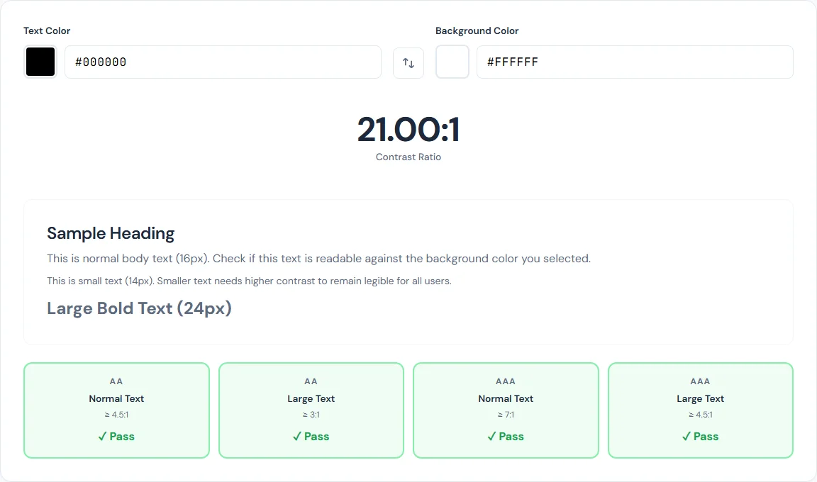
What Is Color Contrast Ratio?
Color contrast ratio is a numerical measurement of how much two colors differ in perceived brightness. The Web Content Accessibility Guidelines (WCAG) define a specific formula for calculating it, and the result is expressed as a ratio like 4.5:1 or 7:1.
Here is how it works at a high level. Every color has a relative luminance value between 0 (pure black) and 1 (pure white). The formula for relative luminance takes the red, green, and blue channels of a color and weights them according to how the human eye perceives brightness:
L = 0.2126R + 0.7152G + 0.0722B
Notice that green contributes the most to perceived brightness (71.52%), followed by red (21.26%), and then blue (7.22%). This is why a bright green feels much lighter than a bright blue at the same saturation level. Each channel value (R, G, B) is first converted from its 0-255 range to a linear value through a gamma correction step before being plugged into this formula.
Once you have the relative luminance of both the foreground and background colors, the contrast ratio is calculated as:
(L1 + 0.05) / (L2 + 0.05)
where L1 is the lighter color and L2 is the darker color. The 0.05 offset prevents division by zero and accounts for ambient light. The result is always between 1:1 (identical colors) and 21:1 (pure black on pure white, or vice versa). The higher the ratio, the easier the text is to read.
WCAG 2.1 Contrast Requirements
WCAG 2.1 defines two conformance levels for contrast: AA (minimum) and AAA (enhanced). Each level has different thresholds depending on text size. Here are the four requirements you need to know:
AA Normal Text — 4.5:1 minimum
This is the baseline requirement for body text, navigation links, form labels, and any other text smaller than 18pt (24px) or 14pt bold (roughly 18.66px bold). If your site targets WCAG AA compliance — which is the standard most organizations aim for and most laws reference — every piece of normal-sized text must meet this ratio against its background.
AA Large Text — 3:1 minimum
Large text is defined as 18pt (24px) and above, or 14pt (approximately 18.66px) and above when bold. Because larger characters are inherently easier to read, the minimum contrast ratio drops to 3:1. This applies to headings, hero text, and large UI elements.
AAA Normal Text — 7:1 minimum
The enhanced level provides a higher standard of readability. WCAG AAA at 7:1 is recommended for body text on sites where reading comprehension is critical — government services, healthcare portals, educational content, and legal documents. While not every organization targets AAA, meeting this level provides the widest possible readability for the widest possible audience.
AAA Large Text — 4.5:1 minimum
For large text at the enhanced level, the requirement is the same as AA normal text: 4.5:1. This ensures headings and large elements remain clearly readable even for users with moderate visual impairments.
Why Contrast Matters Beyond Compliance
The legal argument is real. ADA-related web accessibility lawsuits have increased significantly in recent years, and color contrast failures are among the most commonly cited WCAG violations. But the practical reasons go far beyond avoiding lawsuits.
Color vision deficiency affects roughly 8% of men and 0.5% of women of Northern European descent, with varying rates across other populations. When you add in age-related vision changes — the lens of the eye yellows and pupils shrink as people age, reducing contrast sensitivity — the number of users affected by low contrast grows substantially. By age 60, most people need significantly more contrast than they did at 25.
Environmental conditions matter. A phone screen in direct sunlight effectively reduces the contrast of everything displayed on it. Text that barely passes WCAG AA in a dark office may become completely unreadable on a park bench at noon. Designing for good contrast gives your content resilience across viewing conditions.
Low contrast causes fatigue. Even users with perfect vision in perfect lighting will experience eye strain faster when reading low-contrast text for extended periods. If you want people to actually read your content rather than bouncing after two paragraphs, contrast is one of the simplest factors you can control.
Common Contrast Mistakes
Certain patterns show up repeatedly in accessibility audits. Knowing the usual suspects helps you catch them before they ship.
Light gray text on white. The classic offender. Designers often use #999999 on a #FFFFFF background for secondary text, captions, or metadata. That combination produces a contrast ratio of just 2.85:1, which fails every WCAG level — even AA Large Text. To reach AA Normal Text at 4.5:1, you need at least #767676 on white.
Placeholder text that vanishes. Default browser placeholder text is already low contrast, and many stylesheets make it even lighter. If your form fields rely on placeholder text for instructions (rather than labels), users with low vision may never see them.
Colored buttons with white text. That vibrant orange or light green call-to-action button with white text may look trendy, but many saturated mid-tone colors fail contrast checks against white. A bright #FF9800 orange with white text yields only 2.9:1. You often need to darken the background color more than you expect to reach 4.5:1.
Dark mode with low contrast. Switching to a dark theme does not automatically mean good contrast. Light gray text on a dark gray background can easily fall below 4.5:1 if the gray values are too close together. Dark mode needs the same deliberate contrast checking as light mode.
Text over images. Any time text is placed on top of a photograph or gradient, the contrast ratio varies pixel by pixel. A heading that passes in one spot may fail where the background image is lighter. Without a solid overlay or text shadow, text-over-image designs are a contrast minefield.
How to Check Contrast with the SmarterSources Contrast Checker
Checking a color contrast ratio takes about 10 seconds. Here is how to do it step by step with the free Color Contrast Checker:
- Open the tool. Go to the Color Contrast Checker. No sign-up, no installation — it runs entirely in your browser.
- Enter your foreground color. Type the hex code of your text color into the foreground field, or use the built-in color picker to select it visually. If you need to grab a color from an existing design, the Color Picker tool can extract hex values from any image.
- Enter your background color. Type or pick the background color. If you want to quickly test the reverse combination, use the swap button to flip foreground and background.
- Read the results. The tool instantly calculates the contrast ratio and displays a WCAG compliance grid showing pass or fail status for all four levels: AA Normal, AA Large, AAA Normal, and AAA Large.
- Preview the combination. A live text preview shows exactly how your foreground color looks on the background color at different text sizes, so you can judge readability visually alongside the numbers.
Run this check for every text-and-background pair on your site. That includes body text, headings, links, button text, navigation items, footer text, form labels, error messages, and any text overlaid on colored sections or images.
Fixing Low Contrast
When a color pair fails, you do not need to redesign your entire palette. Small adjustments often fix the problem while preserving the look and feel of your design.
Darken the text slightly. Shifting text from #999999 to #767676 takes it from 2.85:1 to exactly 4.54:1 on a white background — just over the AA threshold. Often a one or two-step change in lightness is all it takes. The visual difference is subtle, but the readability improvement is significant.
Lighten the background. If you cannot change the text color (for example, it is a brand color), try lightening the background instead. Moving from #F0F0F0 to #FFFFFF can be enough to push a borderline ratio over the threshold.
Use the checker iteratively. Adjust one value, check the ratio, adjust again. The Color Contrast Checker updates in real time, so you can dial in the exact shade that meets the requirement while staying as close to your original design as possible.
Add supplementary visual cues. Borders, underlines, and icons can help distinguish interactive elements, but they do not replace adequate text contrast. WCAG measures text-to-background contrast specifically, so a link with a 2:1 contrast ratio does not pass just because it has an underline. Use supplementary cues in addition to good contrast, not instead of it.
Handle text over images with overlays. If text must sit on a photograph, add a semi-transparent dark overlay between the image and the text. A black overlay at 50-60% opacity typically provides enough contrast for white text. Alternatively, use a solid-color banner or a blurred background region behind the text.
Contrast in Dark Mode
Dark mode introduces its own set of contrast considerations. The most common assumption — that dark mode is automatically accessible — is incorrect. You still need to verify every color pair.
One counterintuitive issue: pure white (#FFFFFF) on pure black (#000000) produces a 21:1 ratio, which technically exceeds all WCAG requirements. However, for extended reading, this maximum contrast can actually cause visual discomfort. The extreme brightness difference creates a halation effect for some users, where bright white text appears to bleed into the black background, making letters harder to distinguish rather than easier.
A more comfortable dark mode combination is something like #E0E0E0 text on a #1A1A1A background. This produces a contrast ratio of approximately 15.3:1 — far exceeding AAA requirements while being significantly easier on the eyes for long reading sessions. You can verify this exact pair in the Color Contrast Checker.
For dark mode accent colors, remember that the same color behaves differently on dark and light backgrounds. A blue that passes on white may fail on dark gray, and vice versa. Check every accent, link, and button color separately for your dark theme. Do not assume that passing in light mode means passing in dark mode.
Conclusion
Color contrast checking is one of the simplest, highest-impact accessibility improvements you can make. It takes roughly 10 seconds per color pair, requires no code changes until you find a failure, and directly improves readability for every visitor — not just those with visual impairments.
The requirements are clear: 4.5:1 for normal text (AA), 3:1 for large text (AA), and 7:1 or 4.5:1 for AAA. Most failures can be fixed by darkening text or lightening backgrounds by a few shades.
Test every text-and-background combination on your site. Start with the Color Contrast Checker, grab exact color values with the Color Picker, and work through your pages systematically. Accessible design is not about limiting your palette — it is about making sure the palette you chose actually works for the people reading your content.
BLIPP built SmarterSources to replace expensive subscriptions with free, private tools. Every tool runs in your browser — no sign-ups, no limits.