Understanding Your Baby's Growth Percentiles — A Frustrated Parent's Guide
Here is what happens at every well-child visit: the nurse weighs your baby, measures their length, wraps a tape around their head, and types the numbers into a computer. The pediatrician walks in, glances at the screen, and somewhere between asking about sleep and checking ears says “they’re at the 40th percentile for weight.” No chart. No visual. Just a number, dropped mid-conversation while you’re holding a squirming kid who is trying to eat the stethoscope.
You nod. What else are you going to do? Ask them to pull up the chart and walk you through it line by line while three other families wait? So you file the number away and move on.
Then you get home and the questions start. Is the 40th percentile good? Is it bad? Last time they said 55th—did my kid drop? Should I be worried? You open Google and search “what percentile should my baby be” and find a wall of clinical PDFs, paywalled apps asking for your email, and the WHO’s own website which is a spreadsheet of L, M, and S parameters clearly intended for researchers, not parents.
I went through this enough times to get frustrated enough to build something better. If you’re reading this, you probably know the feeling.
Want to plot your baby's growth percentiles? The tracker uses official WHO data and runs free in your browser.
Track Your Baby's Growth →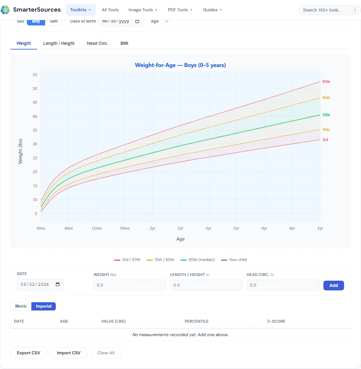
What Growth Percentiles Actually Mean
Let’s start with the thing nobody explains clearly: percentiles are not grades. The 50th percentile does not mean “average” in a pass/fail sense. The 15th percentile does not mean your child is failing. There is no target number you are supposed to hit.
A growth percentile tells you where your child falls compared to other children of the same age and sex. If your baby is at the 30th percentile for weight, it means 30% of babies that age weigh less than yours and 70% weigh more. That is it. It is a position on a curve, not a score.
A baby at the 10th percentile can be perfectly healthy. A baby at the 90th percentile can be perfectly healthy. What matters is:
- Consistency. A baby who has been tracking along the 25th percentile since birth is doing exactly what their body is supposed to do. That is their growth curve.
- Trends. A sudden jump or drop across two or more percentile lines is more meaningful than any single data point. Your pediatrician watches the trajectory, not the number.
- The whole picture. Weight, length, and head circumference together tell a story. One number in isolation does not.
The problem is that you cannot see any of this from a single number mentioned verbally in a 15-minute appointment. You need the chart. And ideally, you need your child’s data plotted on it over time.
WHO Charts vs. CDC Charts
If you have spent any time searching, you have probably noticed there are two sets of growth charts floating around: WHO and CDC. Here is the difference in plain terms:
- WHO charts (0–2 years) are based on the Multicentre Growth Reference Study, which tracked 8,440 breastfed children across six countries (Brazil, Ghana, India, Norway, Oman, and the US). These charts represent how children should grow under optimal conditions—breastfed, healthy environments, non-smoking mothers.
- CDC charts (2–20 years) are based on US national survey data. They describe how American children do grow, which includes formula-fed and breastfed babies, various nutritional backgrounds, and a wider range of conditions.
The CDC recommends using WHO charts for children under 2 because they establish breastfeeding as the biological norm. Most US pediatricians follow this guidance. Our WHO Growth Percentile Chart uses the WHO standards and covers ages 0–5 years.
What Parents Actually Worry About
Let me address the questions you are probably asking right now, because they are the same ones I asked.
“My Baby Dropped Percentiles”
This is the one that sends every parent to Google at midnight. Your baby was at the 60th percentile and now they are at the 35th. Is something wrong?
Maybe. Probably not. Some fluctuation is completely normal, especially in the first year when growth spurts, illness, teething, and feeding changes can temporarily affect weight. A drop of 10–15 percentile points over a single visit is not unusual. What pediatricians look for is a consistent downward trend across multiple visits—crossing two or more major percentile lines over time. One data point is noise. A pattern is a signal.
This is exactly why tracking over time matters more than any single number. If you have the data from three or four visits plotted on a chart, you can see whether the trend is stable or genuinely declining—and bring that to your next appointment.
“My Baby Is in the 5th Percentile”
A low percentile does not mean your child is unhealthy. It means they are smaller than most children their age. Some babies are just small. If both parents are on the shorter side, a baby tracking the 10th percentile for length is doing exactly what their genetics predict. Consistently tracking a low percentile is very different from suddenly falling to one.
Your pediatrician will be concerned if a baby who was at the 50th percentile suddenly drops to the 5th. They will not be concerned if a baby has been at the 5th percentile since birth and continues to track there steadily. Context matters.
“My Baby’s Head Is in the 95th Percentile”
Big heads run in families. If you or your partner have a large head, your baby probably will too. Head circumference percentiles tend to worry parents more than they should, partly because the numbers sound dramatic. “95th percentile” sounds alarming until you realize it just means your baby has a bigger head than most babies their age—which is fine if it has always been big.
What pediatricians watch for is a sudden increase—a head that jumps from the 50th to the 95th percentile over one or two visits. That can indicate increased intracranial pressure and warrants further evaluation. A head that has been large since birth and grows at a consistent rate is just a large head.
The common thread: trends matter more than single data points. Having your child’s measurements tracked visually over time gives you the full picture—and helps you have better conversations with your pediatrician instead of nodding along at a number you cannot contextualize.
The Problem With What Is Out There
When I went looking for a tool to actually see my kid’s growth data on a chart, here is what I found:
- Static PDF charts. The WHO and CDC both publish downloadable PDFs of their growth curves. They are designed to be printed and plotted on by hand with a pencil. In 2026. With a pencil.
- Medical apps. Several apps will chart your child’s growth, but they all require an account, ask for personal health data, and store it on their servers. For something that should be a simple math calculation, that is a lot of trust to hand over.
- Basic calculators. A few websites let you enter one measurement and spit out a percentile number. No chart. No context. No ability to see the trend over time. You get a number that is only marginally more useful than the one the pediatrician told you.
- The WHO website itself. The raw data tables are there if you want to look up Lambda, Mu, and Sigma parameters and run a z-score calculation by hand. I have a feeling most parents do not want to do that.
What was missing: a simple tool where you enter your kid’s measurements, see them plotted on the actual WHO curves with real percentile lines, and track the trend over time. No account required. No data leaving your device.
What We Built
The WHO Growth Percentile Chart does exactly that. Here is what it includes:
- Four chart types. Weight-for-age, length/height-for-age, head circumference-for-age, and BMI-for-age. Switch between them with tabs. BMI is auto-calculated when you enter both weight and length for the same date.
- Real WHO percentile curves. The 3rd, 15th, 50th, 85th, and 97th percentile lines are drawn using the actual WHO LMS data from the Multicentre Growth Reference Study. These are the same curves your pediatrician uses.
- Your data plotted on top. Enter your child’s measurements from each visit and see them as points on the chart. Multiple measurements connect with a line so you can see the trend at a glance.
- Exact percentiles. For each measurement, the tool calculates the exact percentile and z-score. Not just “between the 25th and 50th”—the actual number, like 37th percentile.
- Imperial and metric. Toggle between pounds/inches and kilograms/centimeters. Imperial is the default because that is what most US parents hear at their pediatrician’s office.
- Export to CSV. Download your data as a spreadsheet file. Bring it to your next appointment on your phone or print it out. Your pediatrician will appreciate having the history in front of them.
- Everything stays on your device. No accounts. No servers. No data collection. The tool runs entirely in your browser using localStorage. Your child’s health information never leaves your computer or phone.
Tips for Getting the Most Out of Growth Tracking
Log Measurements Right After Each Visit
The best time to enter data is immediately after the pediatrician appointment while the numbers are fresh. Most practices give you a printout or access to a patient portal where the measurements are recorded. Enter them into the tool before you forget.
Track Consistently
Growth charts work best with regular data points. Well-child visits typically happen at 1, 2, 4, 6, 9, 12, 15, 18, and 24 months, then annually. That cadence gives you a clear trend line. Weighing at home between visits is fine for your own curiosity, but keep in mind that home scales can vary from the calibrated ones at the doctor’s office.
Compare to Your Child, Not to Others
The most common mistake is comparing your child’s percentile to another child’s. “My friend’s baby is in the 80th percentile and mine is in the 30th.” That comparison is meaningless. Your child’s growth curve is theirs alone. What matters is whether they are following their own trajectory consistently.
Bring Your Data to Appointments
Export your measurements as a CSV or just open the tool on your phone at the appointment. Having a visual trend line changes the conversation from “what does that number mean?” to “here is what I am seeing over the last six months.” Pediatricians respond well to parents who come prepared with data.
Do Not Diagnose From a Chart
This tool is for awareness, not diagnosis. A growth chart can show you that something has changed, but it cannot tell you why. That is your pediatrician’s job. Use the chart to identify questions worth asking, not to draw medical conclusions.
Get Started
Open the WHO Growth Percentile Chart, enter your child’s sex and date of birth, and start logging measurements. If you have records from past visits, enter those too—the more data points you have, the clearer the trend. If you are also tracking developmental milestones, the Baby Milestone Tracker covers 100+ CDC milestones from 2–24 months. And for expecting parents, the Pregnancy Weight Gain Tracker does the same thing for pregnancy weight against IOM guidelines.
I built this because I was tired of leaving the pediatrician’s office with a number and no way to understand what it meant. I hope it helps.

BLIPP built SmarterSources to replace expensive subscriptions with free, private tools. Every tool runs in your browser — no sign-ups, no limits.